Riddle me this. The Chart above references a period of fifty years going back to 1962. The blue line is price to earnings on the S&P 500, the red line is the price to earnings on the ten year note (price of bond/coupon)
During this time the United States has gone through:
· The Viet Nam War
· Watergate
· 18% Interest rates
· At least 3 stock market crashes
· A blowjob in the White House
· Dozens of currency crisis
· A Housing Crisis
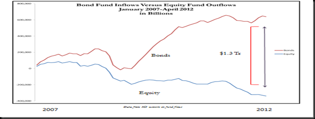
And yet, throughout that entire time, the PE of stocks and bonds has traded within a very tight range. Sometimes stocks were a little more expensive, sometimes bonds were a little more expensive. Since the Financial Crisis, something has changed materially.
Why is it that people are scrambling into bonds which yield nothing, and out of stocks, which yield more?


Forgive the fact there is no conclusion. It is my maiden voyage and I am trying out the software. Conclusions to follow.
No comments:
Post a Comment